


When we need to compare data points from two time periods side by side, we normally use a column chart with two series (for the two time periods) as below:
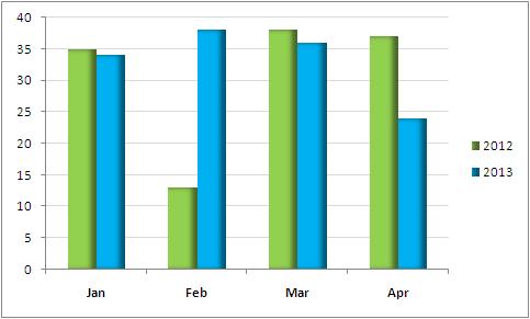
YOY Comparison
But what if we want to see the comparison of categorised data? I have data for two years, let’s take 2012 & 2013 for simplicity. The data points show the number of employees that were hired in each department. I want to see a month by month comparison of each department, and the total as well. It cannot be done using standard charts in Excel. i.e., we can’t have two (or more) stacked columns side by side like below:
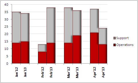
Comparison Stack Chart
However, there is a work around. To get your chart to look like this, you just need to pay attention to how you arrange your data. Here is how it can be done –
- keep the departments as series
- same months of both years should be kept next to each other
- there should be a blank row after each month
This is how your data should look like when ready:

Data – Comparison Stack Chart
Now simply plot a stacked column chart and format series to reduce gap to ‘No Gap‘. The chart is now ready! You can download the workbook Comparison Column Stacked Chart.
Comparison Stack Chart
Previously in Custom Charts:
Custom Charts in Excel :: Heatmap Inspiration
Custom Charts in Excel :: Thermometer Chart
Custom Charts in Excel :: How to Reuse Without Recreating it Time and Again


Very nice concept.. can you post about the waterfall chart?
yes, will post something soon
waterfall chart has now been added… check this out
Just wanted to say, I found several pages trying to explain this method, but yours made it beautifully simple to understand and implement. Thanks
Hi Thomas,
I’m glad I could help. Thanks for your comment. Needless to say, it feels great to read it 🙂
Perfect Solution. Thanks for including the excel file to download. One additional point I discovered, the month’s must be text formatted or else excel plots them in date order rather than side by side comparison as desired.
thanks for pointing that out James. I had not realized that