


This is an age of data, and plenty piles of it (Brad Frost will give you more precise numbers here ;)). What happens when you have this much data is that when creating dashboards, it’s difficult to present it in a manner in which it ‘pops out’ and pulls attention of the viewer. That’s why nowadays, we now have so many types of charts/graphs/visual presentations in place and that’s precisely the reason why ‘effectively communicating information’ has become so important.
I myself work with a lot of dashboards which requires me to create a lots and lots of charts. I’m starting a series of posts where I’ll be sharing some custom charts that I’ve either created or come across. Some of these can really spice up a dull looking report.
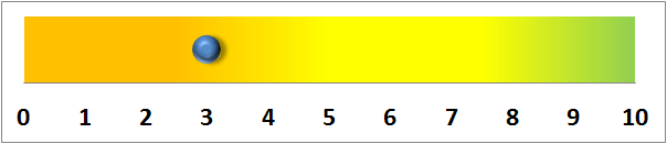
First in the series is a Heatmap that looks like this:

How to Read the Chart?
Suppose there is a scale on which you are measuring something. In my case, it was the skills of a candidate (for a recruitment analysis dashboard) on a scale of 1 to 10. Here, 9-10 was the acceptable value (Green zone), 4-7 was okay (Amber zone) and anything below it was a reject (Red zone). (I have used Orange in place of Red to tone down the colors. You can select any colors that you like).
How to Create the Chart?
- Set up the data – enter the values that you want to use for your scale from the smallest to the largest. The list MUST contain all the possible values that you will be using. E.g. if you wish to plot 2.3 then you need to make your series such that the values increase in increments of 0.1 instead of 1 (unlike in my case where only whole numbers were possible).
- Put a ‘1’ against the value that is your data.
- Plot a X-Y chart using these values. X-series is the list of possible values and Y-series is the column against it.
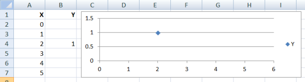
- Adjust the vertical axis scale to minimum as 0 and maximum as 2 (so that 1 lies in the middle of the plot).
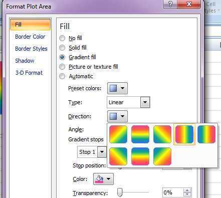
- Go to ‘Format the Plot Area’ option, ‘Fill’ tab.
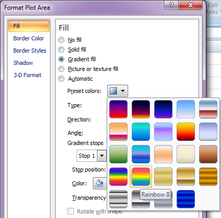
- Select ‘Rainbow I’ or ‘Rainbow II’ as per your wish and select the direction which suits you.
- Adjust colors as per the need. Close it when you have the plot looking like you want it to.
- Remove the vertical axis.

- Now go to ‘Format the Data Series’ -> ‘Marker Options’. Increase marker size and choose the type to round. Play with various options until you have the marker looking like the way you want it to.
- Go to ‘Format Axis’ option of the X-axis, remove the tick-marks and specify intervals as desired.
- Reduce the height of the graph until you are happy with it.


That’s it. The dot will appear against the number where you put ‘1’.
You can manipulate the look of the chart very easily. Reverse colors depending on what you are plotting. Define your own color palette. Basically, just play with it, explore more options.
If you don’t want to do all this work, simply download the file Heatmap. It also has a ready template for slider type look which uses a column chart type and requires a little more manipulation.
If you face any problems or want to know more email us or leave a reply.
More in Custom Charts:
Custom Charts in Excel :: Thermometer Chart
Custom Charts in Excel :: How to Reuse Without Recreating it Time and Again

